By Aaron Kirman
When you're designing a luxury home in Beverly Hills, every detail matters—and color is one of the most powerful design tools we have. The shades you choose influence how people feel in a space, from calm and relaxed to energized and inspired. At my brokerage, I use color psychology in home design to help our clients make spaces not just beautiful, but emotionally impactful.
Whether you're staging to sell or updating your forever home, the right color strategy can transform your interiors in surprising ways.
Key Takeaways
-
Learn how different colors affect mood and perception in luxury homes
-
Discover which hues work best for each room in your house
-
Get design tips tailored for Beverly Hills' luxury lifestyle
-
See how smart color choices can elevate your home's value
Why Color Psychology Matters in Luxury Home Design
Color isn't just visual—it's emotional. Scientific studies have shown that color affects our mood and behavior. The right palette can make a grand space feel more inviting or turn a cozy room into a sophisticated retreat. In Beverly Hills, where luxury and lifestyle go hand in hand, color psychology helps create a refined, cohesive look that resonates with buyers and homeowners alike.
How Color Impacts Mood and Perception
Here are a few key ways color influences the feel of your home:
-
Warm tones like red and orange: Stimulating and energetic, perfect for social spaces.
-
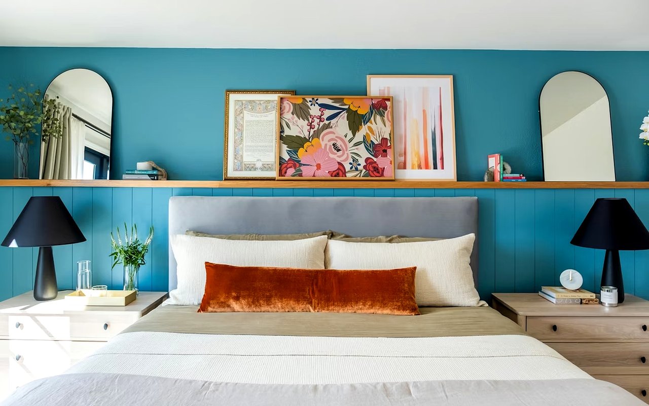
Cool tones like blue and green: Calming and restful, ideal for bedrooms and bathrooms.
-
Neutral shades like beige and gray: Versatile and elegant, often used to create balance or highlight architectural features.
-
Bold colors like black or deep jewel tones: Dramatic and luxurious, best for statement walls or accent pieces.
Using these psychological principles helps us design spaces that feel both intentional and emotionally appealing.
Best Colors for Each Room in a Beverly Hills Home
Each room serves a different purpose, so your color choices should support that function while complementing your home's overall style.
Recommended Palettes by Room
-
Living Room: Soft neutrals like greige or taupe layered with accent colors like navy or emerald to encourage relaxation and conversation.
-
Kitchen: Crisp whites or muted blues that feel fresh and clean while maintaining sophistication.
-
Dining Room: Rich tones like wine red or charcoal for an intimate, luxurious dining experience.
-
Bedroom: Cool tones such as sage green or soft lavender to promote restfulness and calm.
-
Bathroom: Pale blues, clean whites, or subtle sand tones for a spa-like feel.
-
Home Office: Earthy tones like olive or deep blue to enhance focus and productivity.
Tailoring Color Design to the Beverly Hills Lifestyle
Beverly Hills homes are known for their grandeur, light-filled spaces, and seamless indoor-outdoor flow. Color choices here should enhance that natural elegance while speaking to a high-end audience.
What Works in the Local Luxury Market
I often recommend:
-
Soft, tonal palettes that showcase natural materials like stone and wood
-
Custom accent walls using designer wallpapers or bespoke paint colors
-
Metallic accents in gold, brass, or chrome to reflect Beverly Hills' abundant natural light and elevate finishes
-
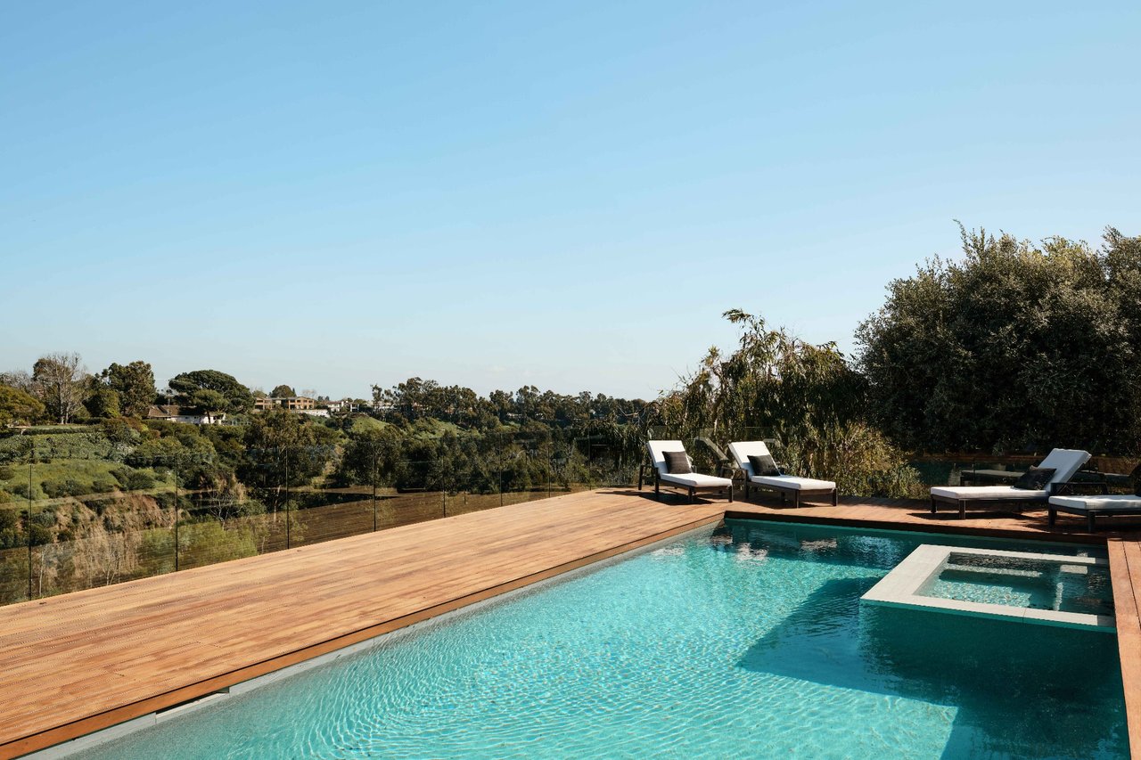
Outdoor color continuity, using hues that mirror landscaping or pool features for harmony between inside and out
These choices ensure the home feels luxurious, cohesive, and ready for discerning buyers.
Staging with Color Psychology in Mind
If you're preparing your home for the market, strategic use of color can speed up the sale and increase perceived value.
Tips for Sellers
-
Use neutral tones throughout to allow buyers to envision their own style
-
Add subtle pops of color through pillows, art, or rugs to create emotional connection
-
Avoid overly personal or loud color schemes that may alienate potential buyers
-
Highlight architectural features with contrasting or complementary colors
Color psychology isn't just aesthetic—it's a sales tool. When staging homes in Beverly Hills, color is used to make buyers feel the lifestyle they're stepping into.
FAQs
What is color psychology in home design?
It's the practice of using color strategically to influence how people feel in a space, enhancing comfort, energy, or sophistication.
Which colors help a home sell faster?
Neutral tones like beige, soft gray, and white tend to appeal most broadly. Paired with subtle color accents, they help create inviting, elegant interiors.
Can I use bold colors in luxury home design?
Yes, in moderation. Bold colors work best as accents or in specific rooms like dining areas or home offices, adding drama without overwhelming the space.
Contact Me at Aaron Kirman Today
If you're ready to elevate your home's design or prepare it for the market, I can help you choose the perfect palette to reflect your goals and lifestyle. I combine expert design insight with deep local knowledge to create homes that truly resonate.
Reach out to me at Aaron Kirman, and I'll guide you through a personalized color strategy that enhances every square foot of your property. Whether you're refreshing your interiors or planning a luxury sale, now is the perfect time to make a bold, beautiful impression.
Reach out to me at Aaron Kirman, and I'll guide you through a personalized color strategy that enhances every square foot of your property. Whether you're refreshing your interiors or planning a luxury sale, now is the perfect time to make a bold, beautiful impression.